Sunday, March 9, 2014

Types of Computers

There are 3 main types of computers.  They are the digital computer, the analog computer, and the hybrid computer.

Digital Computers
On the other hand a digital computer operates on digital data such as numbers. It uses binary number system in which there are only two digits 0 and 1. Each one is called a bit.  The digital computer is designed using digital circuits in which there are two levels for an input or output signal. These two levels are known as logic 0 and logic 1. Digital computers can give more accurate and faster results.  The digital computer is well suited for solving complex problems in engineering and technology. Hence digital computers have an increasing use in the field of design, research and data processing.

Examples of digital computers are:

    1.      Micro Computers - The invention of microprocessor (single chip CPU) gave birth to the much cheaper micro computers. They are further classified into
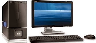
·  Desktop Computers - Today the Desktop computers are the most popular computer systems.  These desktop computers are also known as personal computers or simply PCs. They are usually easier to use and more affordable. They are normally intended for individual users for their word processing and other small application requirements.
·  Laptop Computers - Laptop computers are portable computers. They are lightweight computers with a thin screen. They are also called as notebook computers because of their small size. They can operate on batteries and hence are very popular with travelers. The screen folds down onto the keyboard when not in use.
·  Handheld Computers (PDAs) - Handheld computers or Personal Digital Assistants (PDAs) are pen-based and also battery-powered. They are small and can be carried anywhere. They use a pen like stylus and accept handwritten input directly on the screen. They are not as powerful as desktops or laptops but they are used for scheduling appointments, storing addresses and playing games. They have touch screens which we use with a finger or a stylus.

   2.    Mini/Midrange Computers - Mini computers are lower to mainframe computers in terms of speed and storage capacity. They are also less expensive than mainframe computers. Some of the features of mainframes will not be available in mini computers. Hence, their performance also will be less than that of mainframes.

   3.    Mainframe Computers - Mainframe computers can also process data at very high speeds vi.e, hundreds of million instructions per second and they are also quite expensive. Normally, they are used in banking, airlines and railways etc for their applications.

    4.    Super Computers - When we talk about types of computers, the first type that comes to our mind would be Super computers. They are the best in terms of processing capacity and also the most expensive ones. These computers can process billions of instructions per second. Normally, they will be used for applications which require intensive numerical computations such as stock analysis, weather forecasting etc. Other uses of supercomputers are scientific simulations, (animated) graphics, fluid dynamic calculations, nuclear energy research, electronic design, and analysis of geological data (e.g. in petrochemical prospecting). Example of a supercomputer is the Watson of IBM.  It uses artificial intelligence to solve complex problems.  He has won many times in the popular game show 'Jeopardy'.

Analogue Computers
The analog computer is a computing device that works on continuous range of values. The results given by the analog computers will only be approximate since they deal with quantities that vary continuously. It generally deals with physical variables such as voltage, pressure, temperature, speed, etc.


Hybrid Computers
A hybrid computer combines the desirable features of analog and digital computers. It is mostly used for automatic operations of complicated physical processes and machines. Now-a-days analog-to-digital and digital-to-analog converters are used for transforming the data into suitable form for either type of computation.
For example, in hospital’s ICU, analog devices might measure the patient’s temperature, blood pressure and other vital signs. These measurements which are in analog might then be converted into numbers and supplied to digital components in the system. These components are used to monitor the patient’s vital sign and send signals if any abnormal readings are detected. Hybrid computers are mainly used for specialized tasks.

Saturday, March 8, 2014

Computer System

Computer system is a system of interconnected computers that share a central storage system and various peripheral devices such as a printers, scanners, or routers. Each computer connected to the system can operate independently, but has the ability to communicate with other external devices and computers. A computer system is one that is able to take a set of inputs, process them and create a set of outputs. This is done by a combination of hardware and software.

Data Transfer

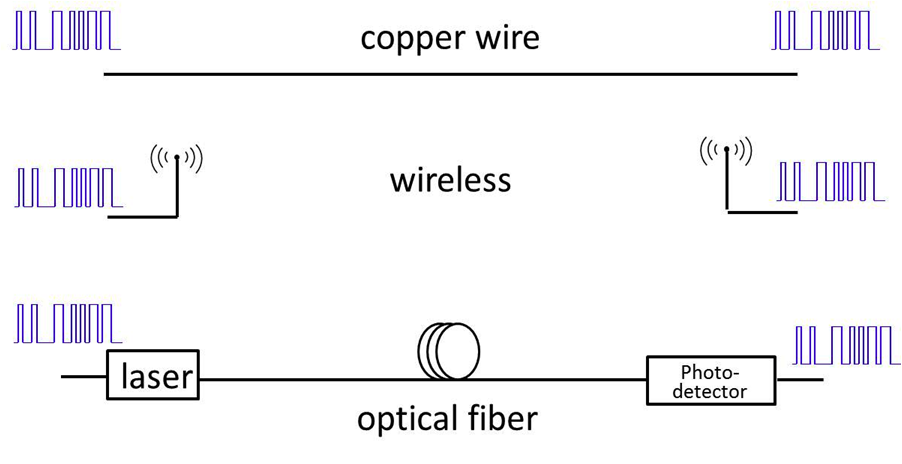
Data Transmission is the process of sending and receiving data via cables (e.g., telephone lines or fibre optics) or wireless relay systems. Because ordinary telephone circuits pass signals that fall within the frequency range of voice communication (about 300–3,500 hertz), the high frequencies associated with data transmission suffer a loss of amplitude and transmission speed. Data signals must therefore be translated into a format compatible with the signals used in telephone lines. Digital computers use a modem to transform outgoing digital electronic data; a similar system at the receiving end translates the incoming signal back to the original electronic data. Specialized data-transmission links carry signals at frequencies higher than those used by the public telephone network. 

Data travels in many types;
either though copper wires,
wireless connection,
or though optical fiber.
The physical transfer of data over communication channel or medium such as copper wires, optical fibers, wireless channel and storage devices.  Data are represented as electromagnetic signals such as an electrical voltage, radio wave, microwave or infrared signal.

Machine Cycle

A machine cycle, also called a processor cycle or an instruction cycle, is the basic operation performed by a central processing unit (CPU). A CPU is the main logic unit of a computer.  An Arithmetic and Logic Unit (ALU) is a digital circuit that performs integer arithmetic and logical operations. The ALU is a fundamental building block of the central processing unit of a computer, and even the simplest microprocessors contain one for purposes such as maintaining timers. 
The steps performed by the computer processor for each machine language instruction received. The machine cycle is a 4 process cycle that includes reading and interpreting the machine language, executing the code and then storing that code.

       Four steps of Machine cycle
  1. Fetch - Retrieve an instruction from the memory.
  2. Decode - Translate the retrieved instruction into a series of computer commands.
  3. Execute - Execute the computer commands.
  4. Store - Write the results back in memory.

Thursday, March 6, 2014

Power "."

Microsoft Office Powerpoint logo
            PowerPoint is software that lets you create materials that can be presented using a projector. Using this material to announce a report or proposal is called a presentation. Using PowerPoint, you can create screens that effectively incorporate colorful text and photographs, illustrations, drawings, tables, graphs, and movies and transition from one to another like a slide show. You can animate text and illustrations on the screen using the animation feature as well as add sound effects and narration. Moreover, you can print out materials to distribute when you are making a presentation.
            PowerPoint is a part of "Office", a suite of products combining several types of software for creating documents, spreadsheets, and presentations, and for managing e-mail.

Why is it called “Office”?
            You might wonder why document creation and spreadsheet software that you use at home are a part of a suite of software called "Office". There is a historical reason for this. Previously, document creation and spreadsheet software were used primarily for work. The software was combined into a suite of software for work so it was called "Office". Since then, personal computers have become popular even in the home, but the software suite, which combines document creation and spreadsheet software, is still called "Office".

Referring to PowerPoint
            PowerPoint is usually referred to as "PowerPoint" in the software screens or help. It is also referred to sometimes as "Microsoft PowerPoint", "Office PowerPoint", and "Microsoft Office PowerPoint Word 2010". They all represent the PowerPoint presentation software.

Can you use PowerPoint to print materials for meetings?

            The main use of PowerPoint is to create screens for presentations and to project them onto a screen using a projector, but it is also widely used to lay out text and drawings on large paper, such as A3, because it lets you lay out the text and drawings freely.

Wednesday, March 5, 2014

Oh no! Not another boring PowerPoint Presentation! My eyes, my eyes…!

            “Oh no! Not another boring PowerPoint presentation! My eyes, my eyes…!”
            One thing’s for sure, the presenter doesn’t know how to make a good presentation (the one that doesn’t hurt your eyes).  Don’t worry, if you follow these simple steps, you can have presentations anywhere!
   

   1.  A little planning goes a long way.
Plan on what you are going to present. Since the point of your slides is to illustrate and expand what you are going to say to your audience, you should know what you intend to say and then figure out how to visualize it.

2.   One thing at a time.
Use only one topic per slide.  The moment that you change your slide with many topics inside it, the audience will be reading all what you have done instead of listening to what you are saying.  Keep th3e presentation bulleted and remember, don’t let the audience advance to the next topic if you are still in the first.
3.  Be simple.
Where most presentations fail is that their authors, convinced they are producing some kind of stand-alone document, put everything they want to say onto their slides, in great big chunky blocks of text.
Congratulations! They’ve just killed a roomful of people. Cause of death: terminal boredom poisoning.
      Don’t let them get bored by those miles and miles of text, instead, cut out the unnecessary words and focus on the main topic of the presentation.  Use big fonts (but not soooo big that the audience would focus on the font and not on the topic) for headings and regular fonts for body texts.
4.  Make it formal.
PowerPoint and other presentation packages offer all sorts of ways to add visual “flash” to your slides: fades, swipes, flashing text, and other annoyances are all too easy to insert with a few mouse clicks.
Avoid the temptation to dress up your pages with cheesy effects and focus instead on simple design basics:
·         Use decorative fonts only for slide headers, and then only if they’re easy to read. Decorative fonts are hard to read and should be reserved only for large headlines at the top of the page.
·         Use good contrast to the presentation.  Put dark text on a light background.  If you must use a dark background – for instance, if you would want to use a standard template with a dark background – make sure your text is quite light (white, cream, light grey, or pastels) and maybe enlarge the font size up two or three notches.
·         Align text left or right. Centered text is harder to read and looks amateurish. Line up all your text to a right-hand or left-hand baseline – it will look better and be easier to follow.
·         Avoid cluttering. A headline, a few bullet points, maybe an image is enough for your message to stand out.  Anything more than that and you risk losing your audience as they sort it all out.
5.  Use images sparingly.
            Use images only when they add important information or make an abstract point more concrete.
No, no, no! Don't use this!
            While we’re on the subject, absolutely do not use PowerPoint’s built-in clipart. Anything from Office 2003 and earlier has been seen by everyone in your audience a thousand times – they’ve become tired, used-up clichés, and I hopefully don’t need to tell you to avoid tired, used-up clichés in your presentations. Office 2007 and non-Office programs have some clipart that isn’t so familiar (though it will be, and soon) but by now, the entire concept of clipart has about run its course – it just doesn’t feel fresh and new anymore.
6.  Think outside the screen.
            Remember, the slides on the screen are only part of the presentation – and not the main part. Even though you’re liable to be presenting in a darkened room, give some thought to your own presentation manner – how you hold yourself, what you wear, how you move around the room.  You are the focus when you’re presenting, no matter how interesting your slides are.
7.  Have them wanting for more.
            Like the best writing, the best presentation shook their audiences early and then reel them in. Open with something surprising or intriguing, something that will get your audience to sit up and take notice. The most powerful hooks are often those that appeal directly to your audience’s emotions – offer them something awesome or, if it’s appropriate, scare them. The rest of your presentation, then, will be effectively your promise to make the awesome thing happen or the scary thing not happen.
8.  Communicate.
            Questions arouse interest, attract curiosity, and engage audiences. So ask a lot of them. Build tension by posing a question and letting your audience stew a moment before moving to the next slide with the answer. Quiz their knowledge and then show them how little they know. If appropriate, engage in a little question-and-answer with your audience, with you asking the questions.
9.  Speak in a friendly tone.
            Especially when you’ve done a presentation before, it can be easy to fall into a drone, going on and on and on and on and on with only minimal changes to your inflection. Always speak as if you were speaking to a friend, not as if you are just reading a script. If keeping up a lively and personable tone of voice is difficult for you when presenting, do a couple of practice run-throughs.
10.  Break the rules.
            As with everything else, there are times when each of these rules – or any other rule you know – won’t apply. If you know there’s a good reason to break a rule, go ahead and do it. Rule breaking is perfectly acceptable behavior – it’s ignoring the rules or breaking them because you just don’t know any better that leads to shoddy boring presentations that lead to boredom, depression, psychopathic breaks, and eventually death. And you don’t want that, do you?

Tuesday, March 4, 2014

A School of Codes

Codeacademy is an online interactive platform that offers free coding classes in six different languages: programming languages like Python, PHP, jQuery, JavaScript, and Ruby, as well as markup languages including HTML and CSS. As of June 2012, the site had over 5 million users who had completed over 100 million exercises. The site has received positive reviews from many blogs and websites, including the New York Times and TechCrunch.
Each individual who joins has their own profile. To motivate users to participate, the site offers feedback, badges for completing exercises, as well as a function that keeps track of a user's total score and total day streak, and displays it to others. There are also CSS and HTML glossaries available within each tutorial. The site allows anyone to create and publish a new course using a Course Creator tool.
Codecademy also provides a forum where enthusiasts, beginners, and advanced coders can come together. There are four main topics: Web (HTML, CSS, JavaScript, and PHP), Ruby, Python, and Miscellaneous.

Visit:  http://www.codecademy.com/  to learn more about basic programming and making applications, games and programs.  You can also learn more about HTML and CSS, in which I have discussed in my earlier posts.

Cascading Style Sheets

CSS is the acronym for “Cascading Style Sheets”. CSS is an extension to basic HTML that allows you to style your web pages.
An example of a style change would be to make words bold. In standard HTML you would use the <b> tag like so:

<b>bold text</b>

This works fine and there is nothing wrong with it by itself, except that now if you wanted to say change all your text that you initially made bold to underlined, you would have to go to every spot in the page and change the tag.
Another disadvantage can be found in this example: say you wanted to make the above text bold, make the font style Arial and change its color to red; you would need a lot of code wrapped around the text.  For example:

<font color="#FF0000" face="Arial"><strong>BLABLABLA</strong></font>

This is lengthy and contributes to making your HTML messy. With CSS, you can create a custom style elsewhere and set all its properties, give it a unique name and then ‘tag’ your HTML to apply these stylistic properties:

<p class="style1">CSS Style</p>

And in between the tags at the top of your web page you would insert this CSS code that defines the style we just applied:

<style type="text/css">
.style1
{
font-family: Arial;
font-weight: bold;
color: #FF0000;
}
</style>

In the above example we embed the CSS code directly into the page itself. This is fine for smaller projects or in situations where the styles you’re defining will only be used in a single page. There are many times when you will be applying your styles to many pages and it would be a hassle to have to copy and paste your CSS code into each page.
Besides the fact that you will be cluttering up your pages with the same CSS code, you also find yourself having to edit each of these pages if you want to make a style change. Like with JavaScript, you can define/create your CSS styles in a separate file and then link it to the page you want to apply the code to:

<link href="blabla.css" rel="stylesheet"  type="text/css">


The above line of code links your external style sheet called “blabla.css” to the HTML document. You place this code in between the <head> </head> tags in your web page.
In making a webpage, time is crucial.  Therefore, CSS is very helpful in terms of saving precious time and having an orderly webpage.

The DIV Attribute

         The div attribute is a generic block-level element. It doesn’t convey any meaning about its contents (unlike a p element that signifies a paragraph, or an h1 or h2 element that would indicate a level 1 or level 2 heading, respectively); as such, it’s easy to customize it to your needs. The div element is currently the most common method for identifying the structural sections of a document and for laying out a web page using CSS.
         Some developers perceive similarities between the p and the div elements, seeing them as being interchangeable, but this isn’t the case. The p element offers more semantic information (“this is a paragraph of text, a small collection of thoughts that are grouped together; the next paragraph outlines some different thoughts”), while the div element can be used to group almost any elements together. Indeed, it can contain almost any other element, unlike p, which can only contain inline elements.
Example:
The HTML below shows two divs being used in conjunction with id attributes to identify different sections of a web page:
<html>
<body>
<div style=“width: 100%; height: 20%; background-color: #e34c97”>
<h1>This is the heading</h1>
</div>
<div style=“width: 100%; height: 70%; background-color: #98cd89”>
<h4>This is the main content</h4>
</div>
<div style=“width: 100%; height: 10%; background-color: #870bc4”>
<small>This is the footer</small>
</div>
</body>

</html>

Adding HTML Images, Tables, and Hyperlinks

HTML Images - The <img> Tag, the Src, and the Alt Attribute
In HTML, images are defined with the <img> tag.  The <img> tag is empty, which means that it contains attributes only, and has no closing tag.  To display an image on a page, you need to use the src attribute. Src stands for "source". The value of the src attribute is the URL of the image you want to display.
Example:
<img src="blabla.jpg" alt="error">
(Hello there! This picture was inserted using the <img> tag)
The required alt attribute specifies an alternate text for an image, if the image cannot be displayed.  The example given above has an alt attribute showing that if the image can’t be displayed, a text “error” is displayed.  The alt attribute provides alternative information for an image if a user for some reason cannot view it (because of slow connection or an error in the src attribute).

HTML Images – How to Set Height and Width of an Image
The height and width attributes are used to specify the height and width of an image. 
Example:
<img src="blabla.jpg" alt="error" width="800" height="600">

            Changing the width and the height attributes can make the image bigger or smaller according to the size of the image.  By the way, the height and width is measured in pixels.  

HTML Hyperlinks
          The HTML <a> tag defines a hyperlink.  A hyperlink (or link) is a word, group of words, or image that you can click on to jump to another document.  When you move the cursor over a link in a Web page, the arrow will turn into a little hand.  The most important attribute of the <a> element is the href attribute, which indicates the link's destination.  Between the start and the end tags is the text shown in the web site. . 

Example:
<a href=“http://www.google.com”>Google</a>

By default, links will appear as follows in all browsers:
  • An unvisited link is underlined and blue
  • A visited link is underlined and purple
  • An active link is underlined and red

Monday, March 3, 2014

HTML Formatting Tags

        The following HTML tags are used to format the appearance of the text on your web page. This can brighten up the look of the web page, however, too much variety in the text formatting can also look displeasing.  Example are:
Header - <h1> </h1>
There are 6 levels of headings available, from h1 for the largest and most important heading, down to h6 for the smallest heading.
Bold - <b> </b>
The text in between the tags will be bold, and stand out against text around it, the same as in a word processor.
Italic - <i> </i>
Also working the same way as a word processor, italics displays the text at a slight angle.
Underline - <u> </u>
Again, the same as underline in a word processor. Note that html links are already underlined and don't need the extra tag.
Strike-out - <strike> </strike>
Puts a line right through the centre of the text, crossing it out. Often used to show that text is old and no longer relevant. Also works by using <s> </s> instead.
Preformatted Text - <pre> </pre>
Any text between the pre tags, including spaces, carriage returns and punctuation, will appear in the browser as it would in a text editor (normally browsers ignore multiple spaces)
Source Code - <code> </code>
Similar to tt the text is displayed in a fixed-width font, and is commonly used to show source code. I have used it on this site, along with stylesheets, to show all tags.
Typewriter Text - <tt> </tt>
The text appears to have been typed by a typewriter, in a fixed-width font. For example: This text is written using the <tt></tt> tags.
Block Quote - <blockquote> </blockquote>
Defines a long quotation, and the quote is displayed with an extra wide margin on the left hand side of the block quote.
Small - <small> </small>
Instead of having to set a font size, you can use the small tag to render text slightly smaller than the text around it. Useful for displaying the 'fine-print'.
Font Color - <font color="color_name/hex_number_/rgb_number"> </font>
Change the colour of a few words or a section of text. The 6 question marks represent the hex color code.

                                                         Attribute Values
Value
Description
color_name
Specifies the text color with a color name (like "red")
hex_number
Specifies the text color with a hex code (like "#ff0000")
rgb_number
Specifies the text color with an rgb code (like "rgb(255,0,0)")

Font Size - <font size="5"> </font>
For an immediate change of font size with respect to the font size preceding it, this tag increase or decreases the size of the font by the number you specify. 
Change Font Face - <font face="Arial"> </font>
To show text in a particular font, use the font name such "Helvetica" or "Arial" or "Courier". Be aware that using some fancy font from your computer means that the person viewing that page must also have that font installed on their computer too, otherwise it will look totally different to them. 
Centre - <center> </center>
A useful tag, as it says, it makes everything in between the tags centred (in the middle of the page).
Emphasis - <em> </em>
Used to emphasize text, which usually appears in italics, but can vary according to your browser.
Strong Emphasis - <strong> </strong>
Used to emphasize text more, which usually appears in bold, but can vary according to your browser.

Hyper Text Markup Language

         HTML or HyperText Markup Language is the main markup language for creating web pages and other information that can be displayed in a web browser.
             HTML is written in the form of HTML elements consisting of tags enclosed in angle brackets (like <html>), within the web page content. HTML tags most commonly come in pairs like <h1>and </h1>, although some tags represent empty elements and so are unpaired, for example <img>. The first tag in a pair is the start tag, and the second tag is the end tag (they are also called opening tags and closing tags). In between these tags web designers can add text, further tags, comments and other types of text-based content.
           The purpose of a web browser is to read HTML documents and compose them into visible or audible web pages. The browser does not display the HTML tags, but uses the tags to interpret the content of the page.
          HTML elements form the building blocks of all websites. HTML allows images and objects to be embedded and can be used to create interactive forms. It provides a means to create structured documents by denoting structural semantics for text such as headings, paragraphs, lists, links, quotes and other items. It can embed scripts written in languages such as JavaScript which affect the behavior of HTML web pages.
               The latest version of HTML is HTML 5.  

What is HTML5?


            HTML5 is the latest standard for HTML.  The previous version of HTML, HTML 4.01, came in 1999, and the internet has changed significantly since then.  HTML5 was designed to replace both HTML 4, XHTML, and the HTML DOM Level .  It was specially designed to deliver rich content without the need for additional plugins.  The current version delivers everything from animation to graphics, music to movies, and can also be used to build complicated web applications.  HTML5 is also cross-platform.   It is designed to work whether you are using a PC, or a Tablet, a Smartphone, or a Smart TV.

How Did HTML5 Get Started?

           HTML5 is a cooperation between the World Wide Web Consortium (W3C) and the Web Hypertext Application Technology Working Group (WHATWG).  WHATWG was working with web forms and applications, and W3C was working with XHTML 2.0. In 2006, they decided to cooperate and create a new version of HTML.  Some rules for HTML5 were established:

  • New features should be based on HTML, CSS, DOM, and JavaScript
  • The need for external plugins (like Flash) should be reduced
  • Error handling should be easier than in previous versions
  • Scripting has to be replaced by more markup
  • HTML5 should be device-independent
  • The development process should be visible to the public